Christine Bui
Product Designer
Research
We began our research by doing some competitive and comparative analysis. We took a look at IGN.com, Youtube, Steam, and Netflix. The knowledge that we gained from our research helped us pinpoint 3 aspects of the homepage that we wanted to redesign. The hero carousel, search bar, and the news feed.
Current Crunchyroll Homepage
The hero carousel shows featured videos, however, the same type of information is displayed in the column on the right-hand side.
As you continue to scroll, you get an overload of information making it difficult to focus on one thing at a time. Just below the "Latest News" section is "Site News", "All-New Anime", "All-New Drama", and on the right-hand side is the forum discussion and "Coming Soon". All of these sections can be easily missed if the user doesn't scroll down far enough.
Our Redesign
We cleaned up the front page by simply rearranging the information given and creating a clear visual hierarchy. The new hero carousel will display all of the necessary information without having to click on the thumbnail. The advertisement will live directly underneath the carousel. "All-New Anime" and "All-New Drama" are now displayed in the same section at the "Simulcasts". Both "News" and "Site News" have been grouped in the same section at the very bottom. Forums should only be accessed by clicking on "Forums" in the navigation. The removal of this information from the front page allows for more breathing room.
Interactions
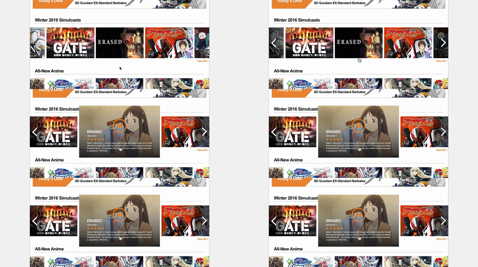
We built these animations in After Effects to show how the interactions of our redesign will look like.
Search Bar
In order to save more space in the navigation, we opted for a search bar that will only be displayed once clicked.
Hero Carousel
The carousel will automatically scroll through each featured video in order to give the user a glimpse of each show without having to click around.
Hover Preview
The user will now have the ability to view a show's information without having to leave the page


